Happy Sunday, friends! We've been busy, busy, busy around these parts finishing up our latest project and starting a new one. Not only have we completed our latest remodel, but we are tying up all the components of turning a lifelong dream into a reality: owning our own business! It's pretty amazing how many teeny tiny little details go into launching a successful business, but it really reflects the same amount of focus and structure that these remodels require.
Our latest project was extremely stressful and has been one of our bigger projects. Although the design process has been my focus, the other half of the project involves budgeting, negotiating, and pricing. This is not my forte', clearly, so I am extremely lucky to have a wonderful partner in my fiancé. He spends countless hours with extremely tedious number crunching, and is the reason why we have been able to turn this dream of ours into something tangible. He's the real reason why I am able to bring my vision to fruition and deserves all the credit.
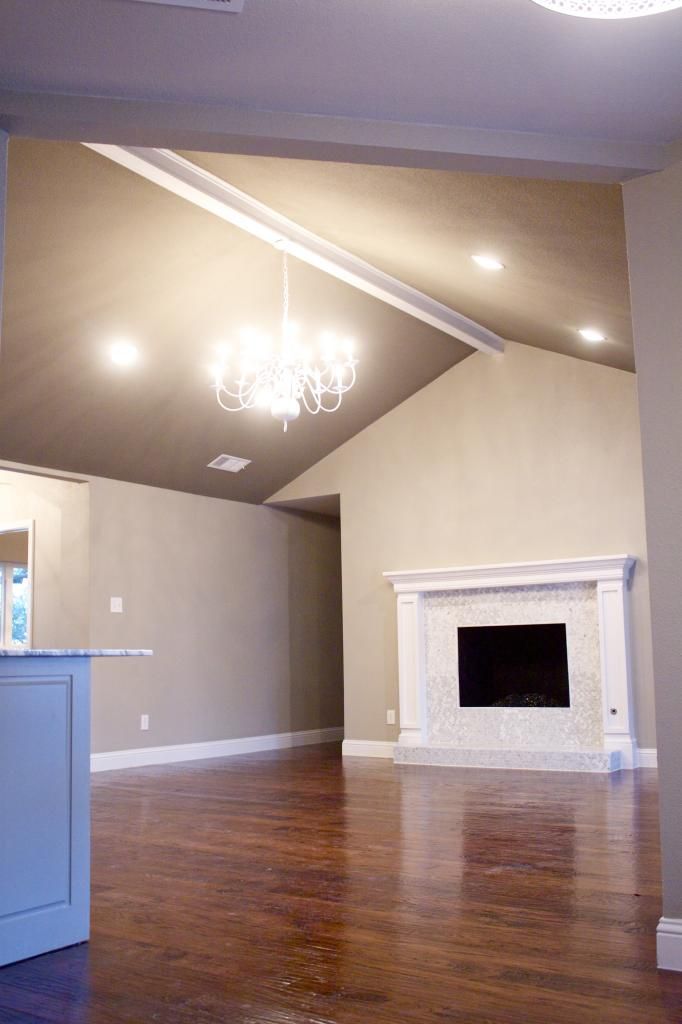
Mercedes, as we call this project, certainly deserves this high end moniker. It's glam, chic, sparkly - basically everything I love in both fashion and interiors. We took this home down to the studs and completely restructured the heart of the house. Now the living, kitchen, dining, and entry are functional and have a great flow. We are so very proud of how it turned out and we had a record setting offer within 48 hours. We hope you love it as much as we do!
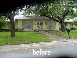
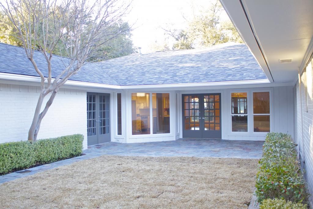
We obviously had to get rid of the applesauce that has moved through an infants intestinal tract color of the brick and shutters. On top of that, we needed to replace the front door, roof, and windows, change out the light fixtures, and add a good deal of landscaping. I chose a very light grey, almost white, for the brick, and a contrasting darker grey for the shutters and glittering front door. I love how the super white windows pop off both of those colors. The roof is a two-tone stone color that gives a little depth and isn't just a solid color. I would highly recommend choosing this type of shingle if you are doing roof replacement. It makes such an impact. I added some modern house numbers that automatically let outsiders know that the home is modern and bright after you walk inside, but the traditional light fixtures keep everything grounded. My future mother-in-law helped with the landscape choices and she is such a lifesaver because plants are definitely not in my wheelhouse.
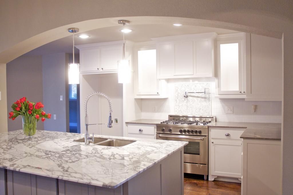
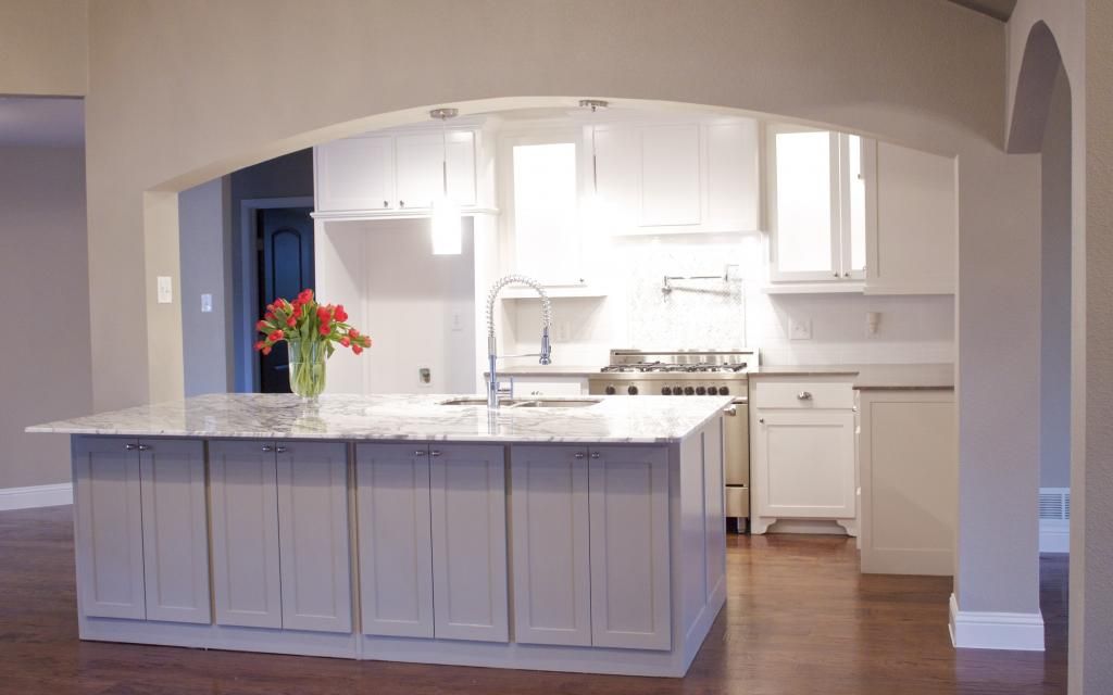
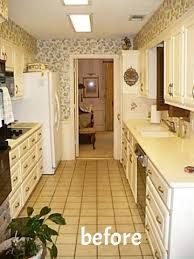
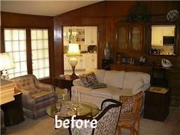
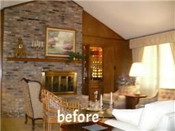
As you've seen with the other homes that I've featured on WorkdayWeekend, there is generally a wall (or two or three in this case) that we open up to give the living areas better flow. No surprise here that we completely removed the wall that formerly separated the living room from the kitchen and breakfast area. This room is very wide and needed support from above. Instead of simply having a straight line between the supports, I opted for arches, which we carried into the dining area and office. It adds a little architectural detail and creates a softer line with all the angles in this room.
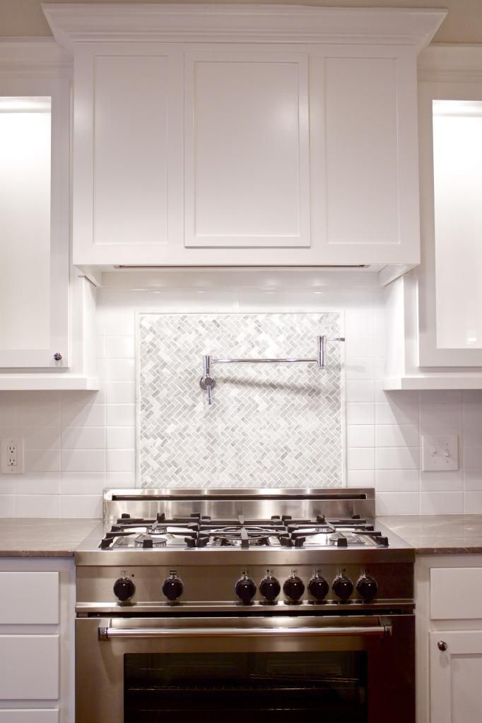
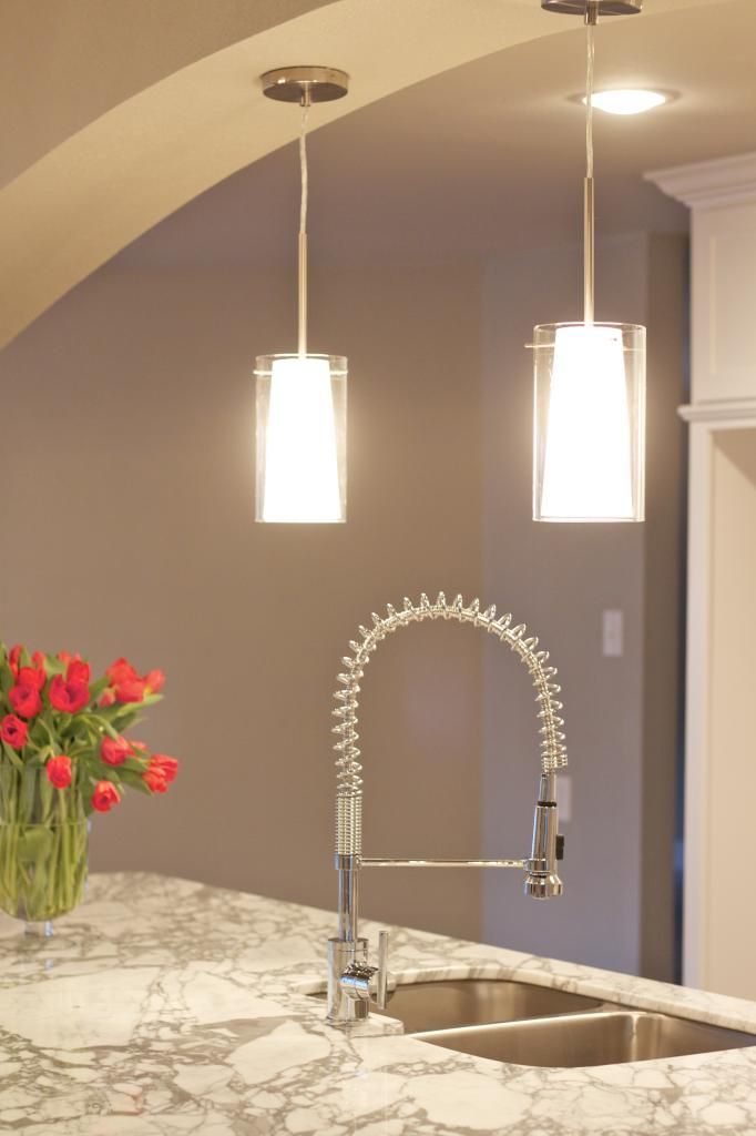
Since the ceiling line is lower in the kitchen because of the support, I kept the sight line from behind the island to the rest of the home clean and uncluttered. I chose two clear glass pendants, even though the space could have held three. I didn't want to junk the space up by blocking the view of the back splash and mantle, nor did I want the new owner to feel like they were staring at a pendant when they were at the kitchen sink. I used two opposing colors of marble on the island (Statuary Carrara) and against the back splash (Astoria Grey) to offset the cabinet colors. Chrome fixtures and pulls bring it all together.
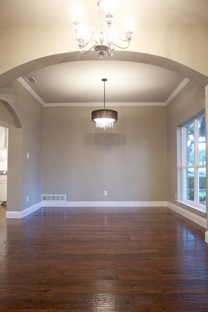
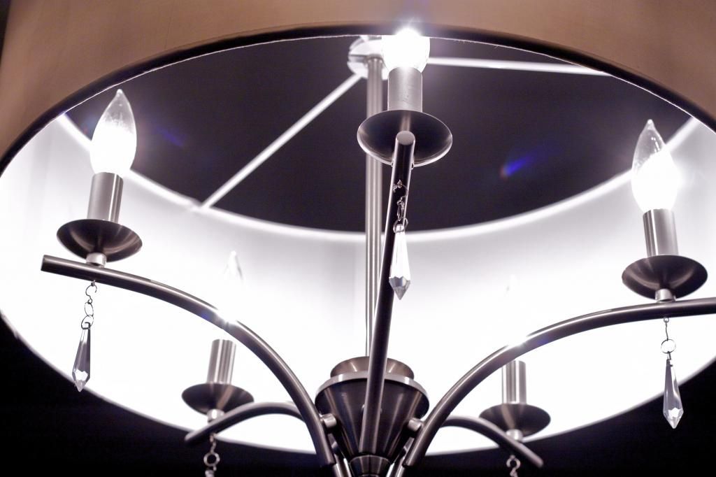
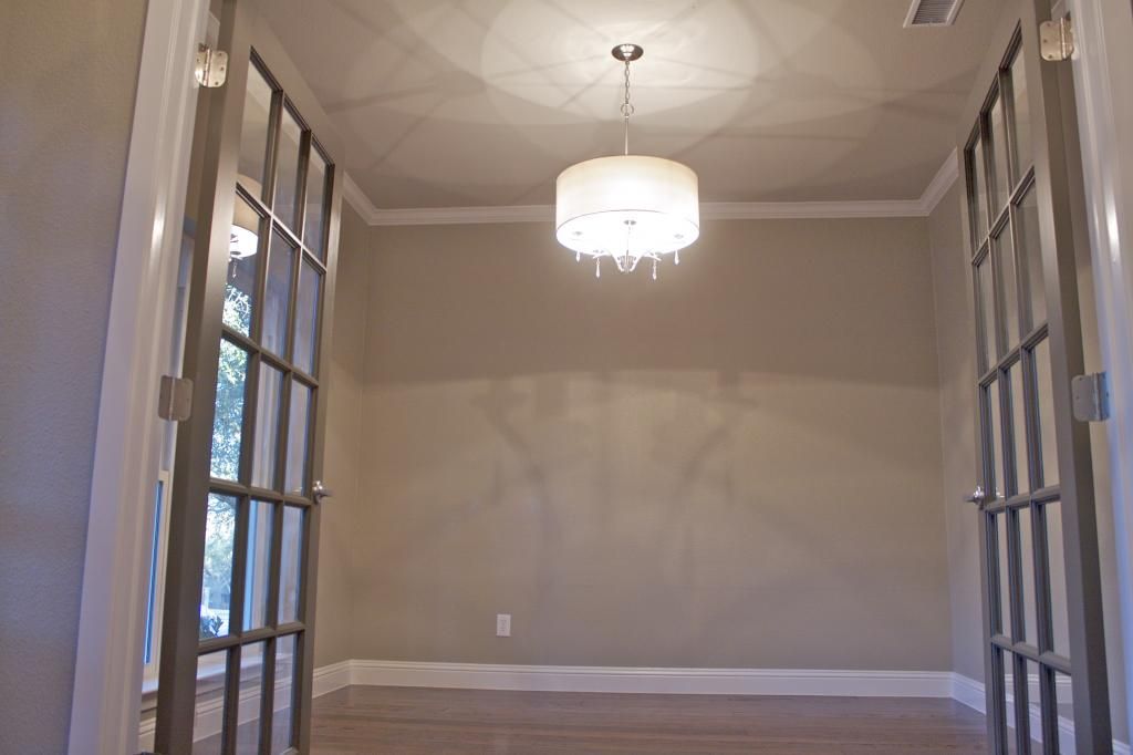
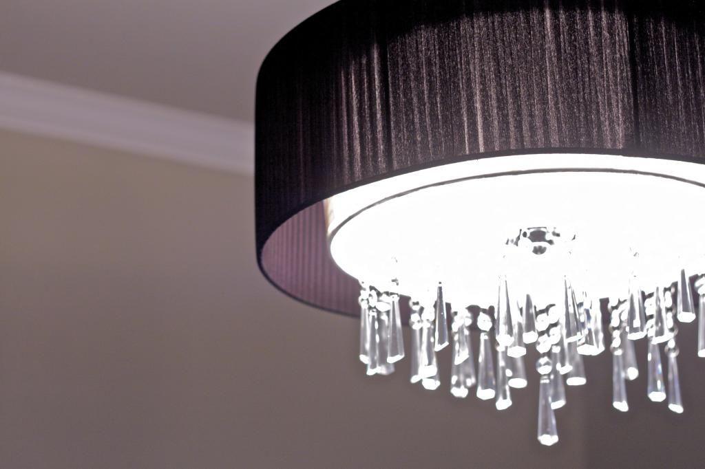
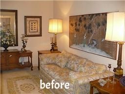
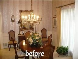
The original layout was very 1960's parlor party. The dining room and formal living were very closed off and the Mad Men error of living is long gone. We opened up a formal dining room and created a true office with double doors. Glam lighting sets the stage for the prospective owner's fabulous dining table and office furniture. I'm seeing a mirrored china cabinet with plush chairs and a black lacquer campaign desk. But that's just me.
The master suite is pretty fantastic. Nine times out of ten, we buy these fixer uppers knowing that we will need to completely reconfigure the master bedroom, bath, and closet. Luckily, the fab old lady who lived here once upon a time was a clotheshorse and understood the need to have a big bathroom. We still gutted the entire thing, but the sizes of the rooms and the walls stayed in place.
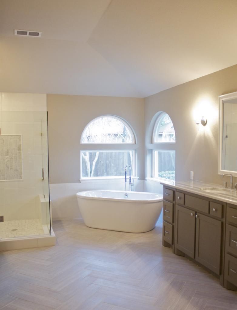
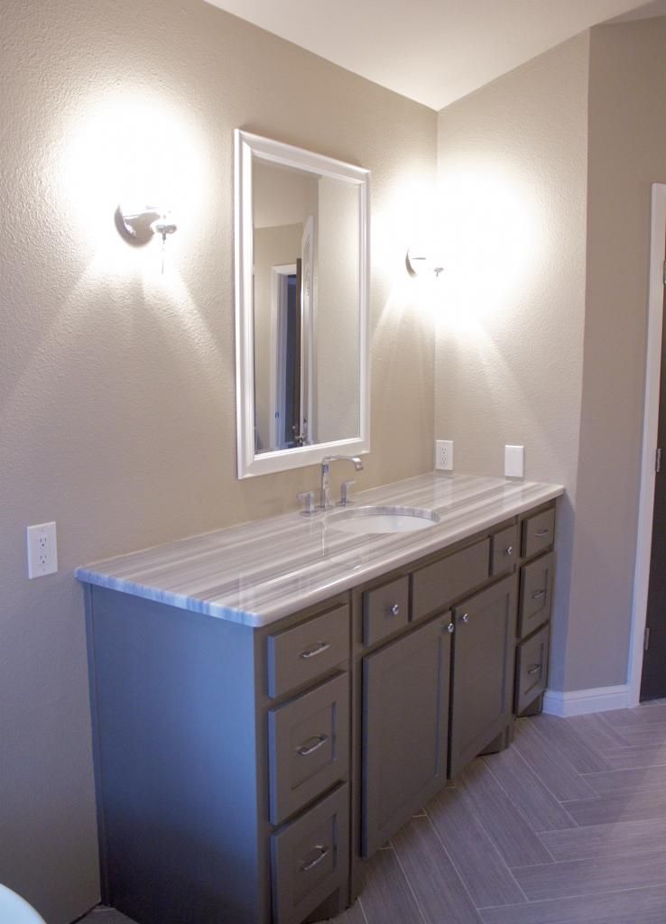
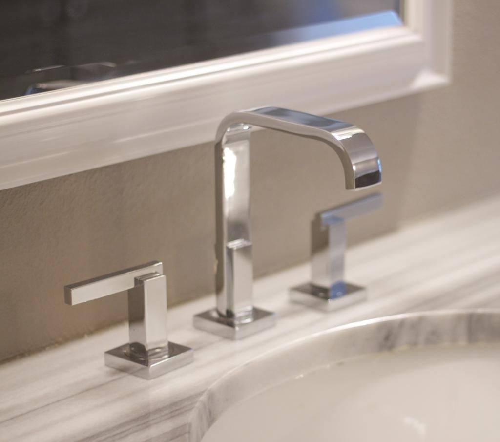
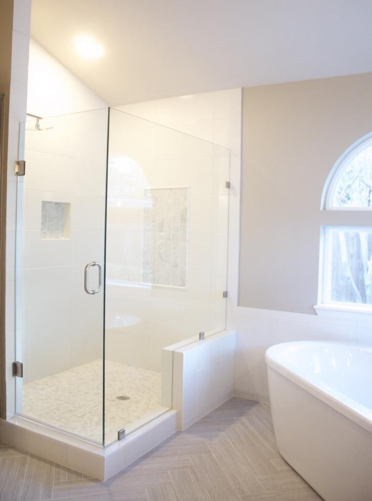
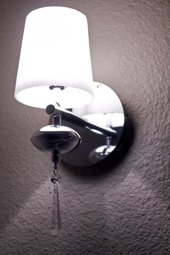
I cannot for the life of me find the before pics of the bathroom, so bear with me in my virtual walk-thru. I have been waiting for the opportunity to lay tile in a herringbone pattern and the second I saw the size of the master bath, I knew I would finally get to experiment with it. We removed a monstrosity of a bathtub to make way for the free standing tub and filler and changed the shape of the shower which was formerly a corner unit. I chose (again) chrome fixtures, sconces, and cabinet pulls for a little sparkle and the MaraMara Marble was a risk that I was willing to take. I knew it was specific and a tad bit modern, but when I saw the slab, I totally fell in love with it.
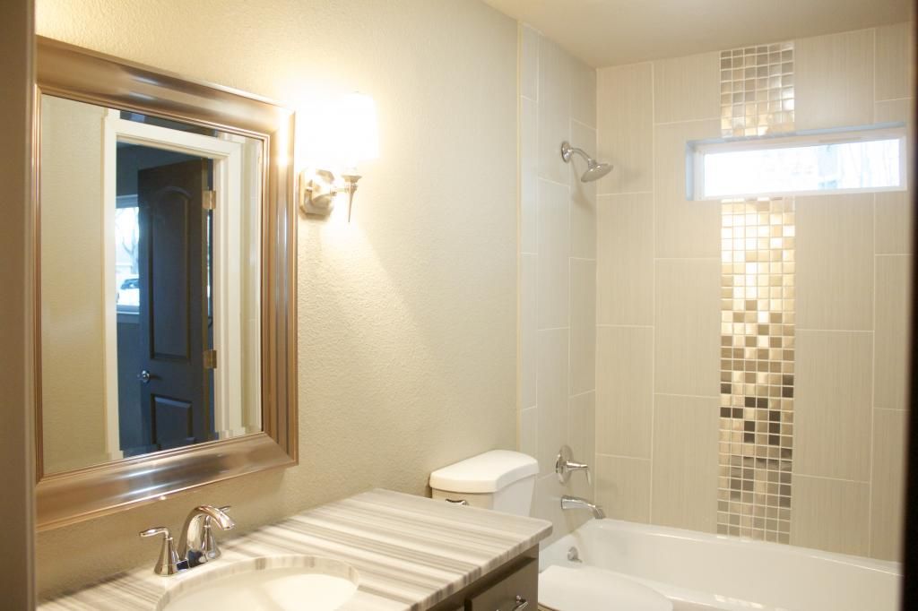
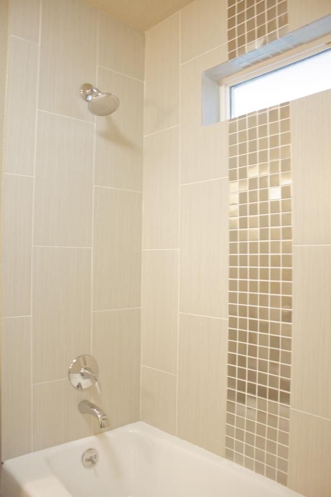
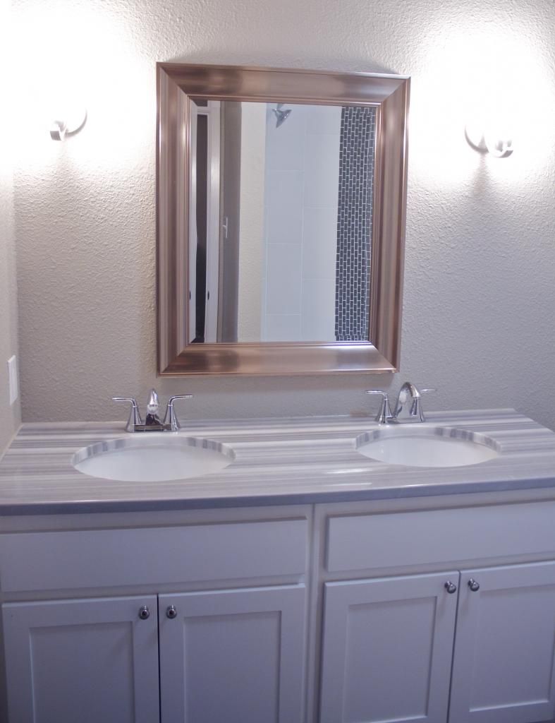
Detail in secondary bathrooms is extremely important, but there is no need to spend the same amount of money you spend in the master bathroom. If you are looking to sell, make sure that you pay attention to little things in your additional bathrooms because most people don't and it will set you apart from the competition. If you aren't looking to sell, you will certainly want your guests and kiddos to have a fun space as well. I had a lot of fun designing each of these bathrooms, one for the kids since it was a Jack and Jill style bath, and the other for the split bathroom far on the opposite side of the home. In the kids room, I used a fun smoky glass mosaic tile and very durable honed white tiles on the shower wall. These tiles are great because they hide dirt, soap, water spots, etc. The floors (although you can't see them) are a dark gray linear pattern with light grey grout. For the guest bathroom, I wanted it to feel very luxe, like a hotel or a spa. I used stainless steel mosaic alongside light grey wall tiles and light tiles on the ground, in order to offset the grey cabinetry.
We did a lot of work on the outside of Mercedes, not because it was poorly cared for, but because it was terribly outdated. The former patio was those aggregate pebbles that were laid in tar and feel like razorblades when you walk across them. I had the idea to lay slate on the patio and under the walk way before I chose the paint colors and it couldn't have turned out more beautifully. We replaced the fence and laid new sod to set it all off. I think this is a fabulous back yard and could hold a small pool with minimal lines if the new owners wanted to put that in.
We love hearing feedback on what you think, maybe what you would have done differently, and of course if you love it like we do ;) Thanks for coming along on the tour!
xoxo,
sarah








Sarah, this looks incredible!! You guys are so talented! My husband and I are in the process of buying a house, (we're looking Frisco) and this is so inspiring. I'll be picking up decorating tips from you for sure!
ReplyDeleteMeredith
createthatoutfit.com
Sarah I love this! You did an amazing job and definitely have an eye for design. We are building a house and deciding which way to go with the look and I am loving the color palette of this house. In love!
ReplyDelete-Heather B.
WOW!!!!!!!!!!!!!!!!!!!!!!!!
ReplyDeleteWonderful transformation!
What an amazing transformation!!!
ReplyDelete