Showing posts with label home. Show all posts

2.09.2014

Home Sweet Sunday - Mercedes Remodel

Happy Sunday, friends!  We've been busy, busy, busy around these parts finishing up our latest project and starting a new one.  Not only have we completed our latest remodel, but we are tying up all the components of turning a lifelong dream into a reality: owning our own business!  It's pretty amazing how many teeny tiny little details go into launching a successful business, but it really reflects the same amount of focus and structure that these remodels require.

Our latest project was extremely stressful and has been one of our bigger projects.  Although the design process has been my focus, the other half of the project involves budgeting, negotiating, and pricing.  This is not my forte', clearly, so I am extremely lucky to have a wonderful partner in my fiancĂ©.  He spends countless hours with extremely tedious number crunching, and is the reason why we have been able to turn this dream of ours into something tangible.  He's the real reason why I am able to bring my vision to fruition and deserves all the credit.

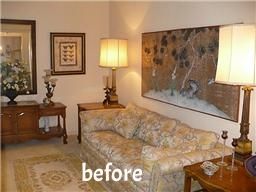
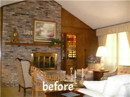
Mercedes, as we call this project, certainly deserves this high end moniker.  It's glam, chic, sparkly - basically everything I love in both fashion and interiors.  We took this home down to the studs and completely restructured the heart of the house.  Now the living, kitchen, dining, and entry are functional and have a great flow.  We are so very proud of how it turned out and we had a record setting offer within  48 hours.  We hope you love it as much as we do!


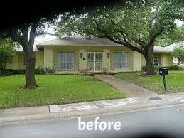
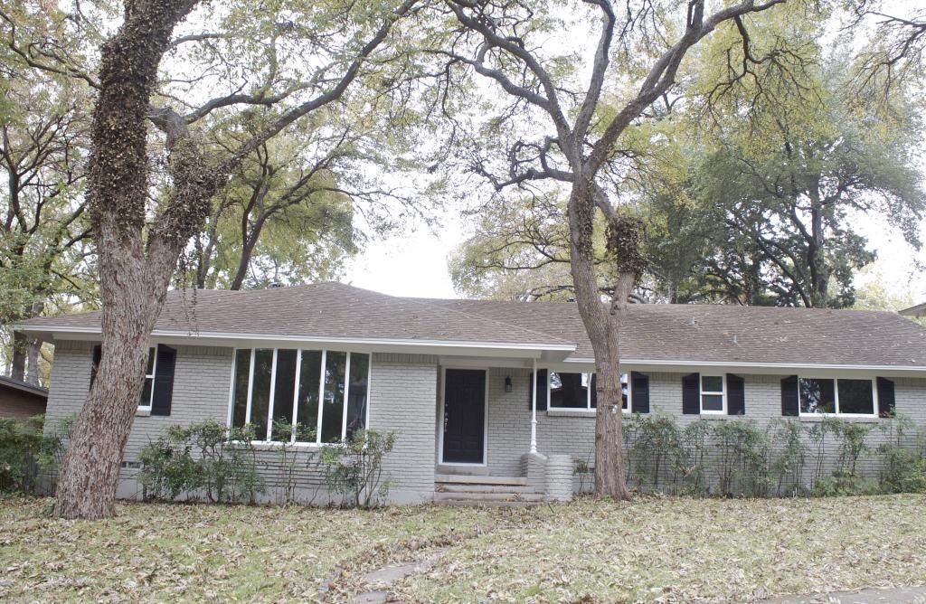
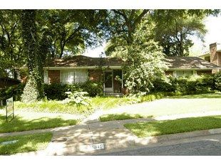
We obviously had to get rid of the applesauce that has moved through an infants intestinal tract color of the brick and shutters.  On top of that, we needed to replace the front door, roof, and windows, change out the light fixtures, and add a good deal of landscaping.  I chose a very light grey, almost white, for the brick, and a contrasting darker grey for the shutters and glittering front door. I love how the super white windows pop off both of those colors.  The roof is a two-tone stone color that gives a little depth and isn't just a solid color.  I would highly recommend choosing this type of shingle if you are doing roof replacement.  It makes such an impact.  I added some modern house numbers that automatically let outsiders know that the home is modern and bright after you walk inside, but the traditional light fixtures keep everything grounded.  My future mother-in-law helped with the landscape choices and she is such a lifesaver because plants are definitely not in my wheelhouse.


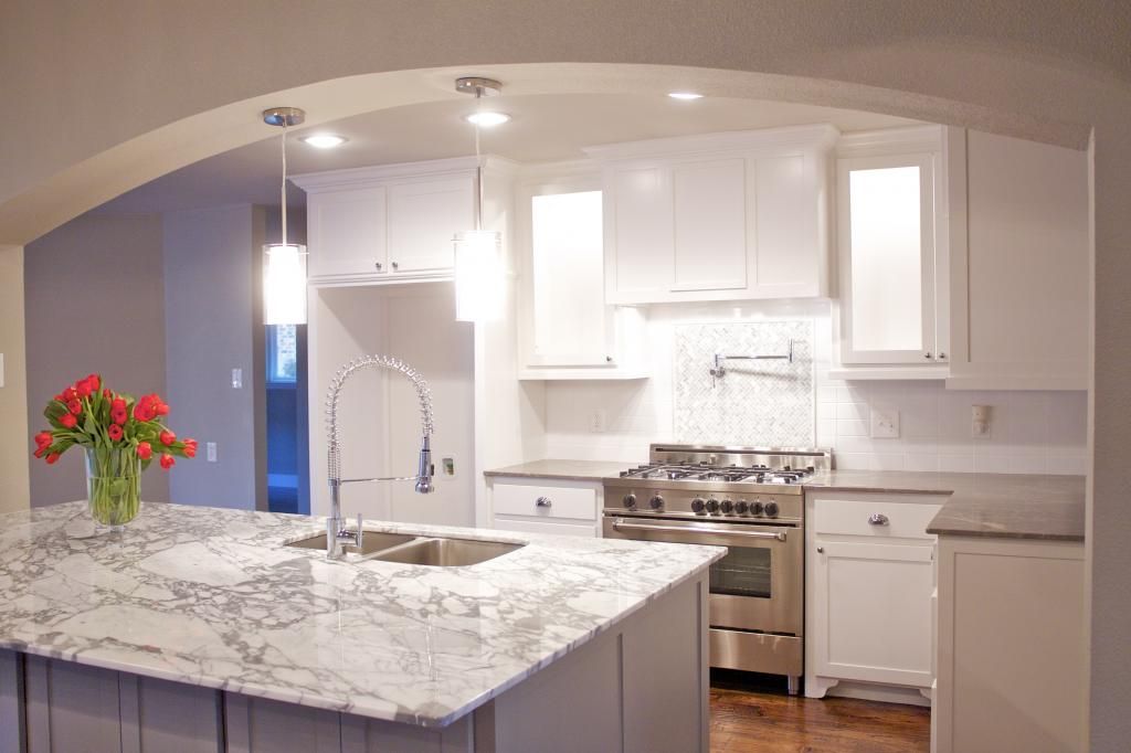
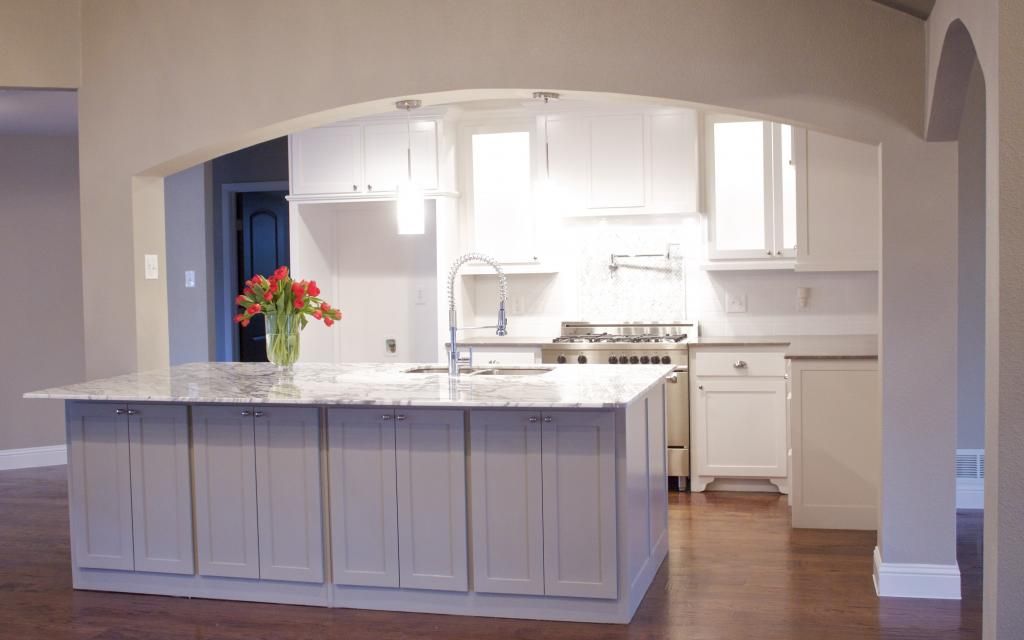
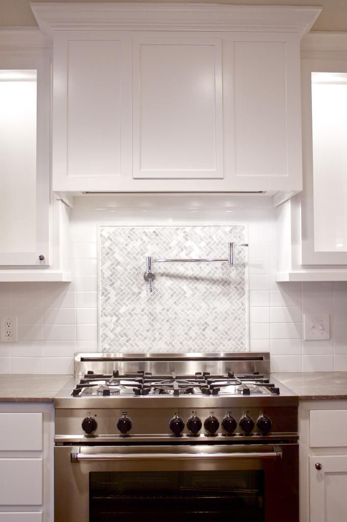
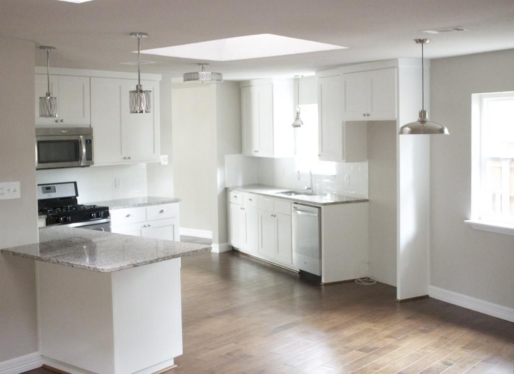
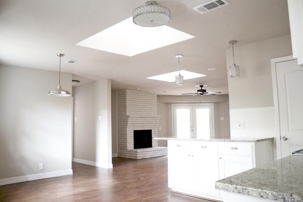
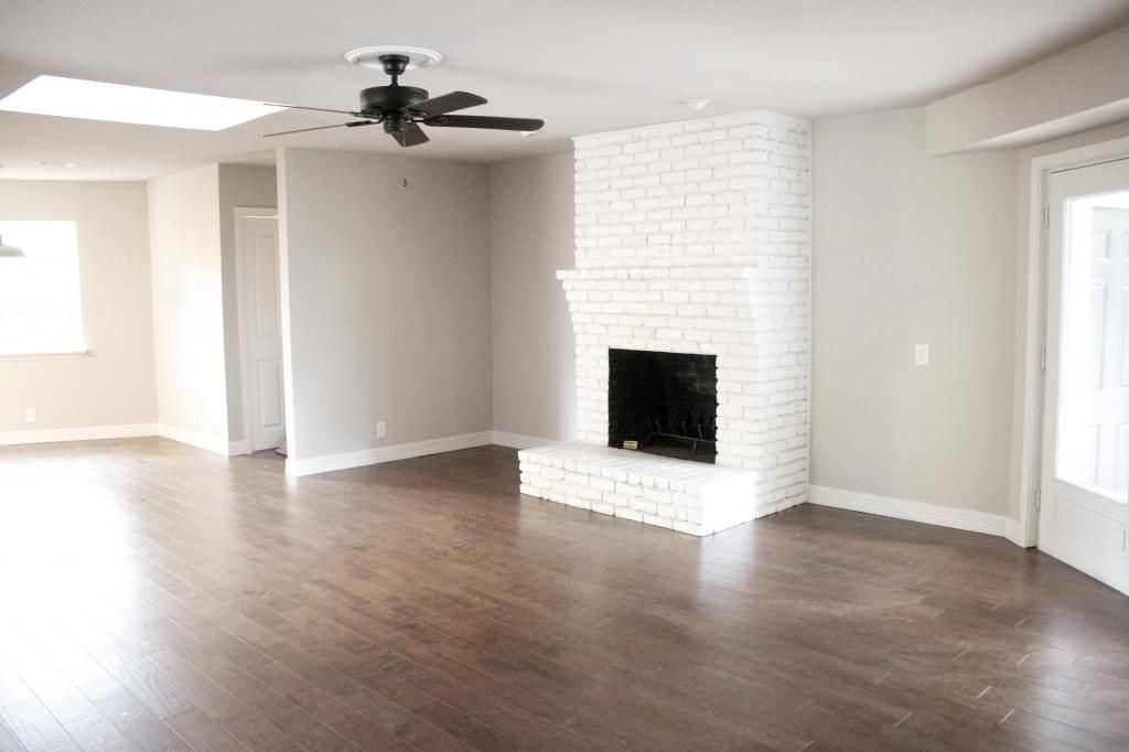
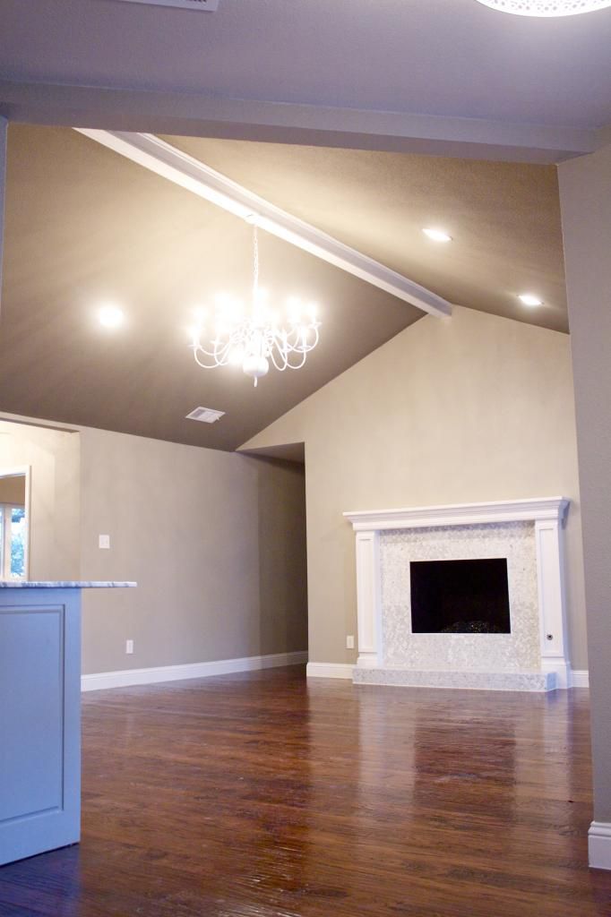
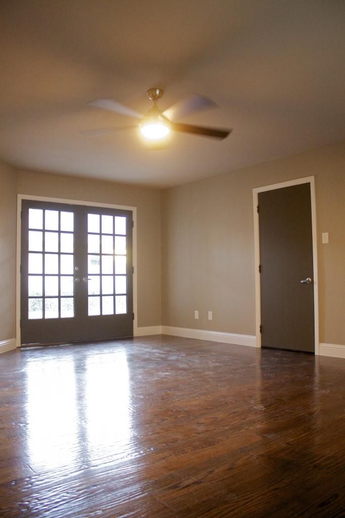
As you've seen with the other homes that I've featured on WorkdayWeekend, there is generally a wall (or two or three in this case) that we open up to give the living areas better flow.  No surprise here that we completely removed the wall that formerly separated the living room from the kitchen and breakfast area.  This room is very wide and needed support from above.  Instead of simply having a straight line between the supports, I opted for arches, which we carried into the dining area and office.  It adds a little architectural detail and creates a softer line with all the angles in this room.

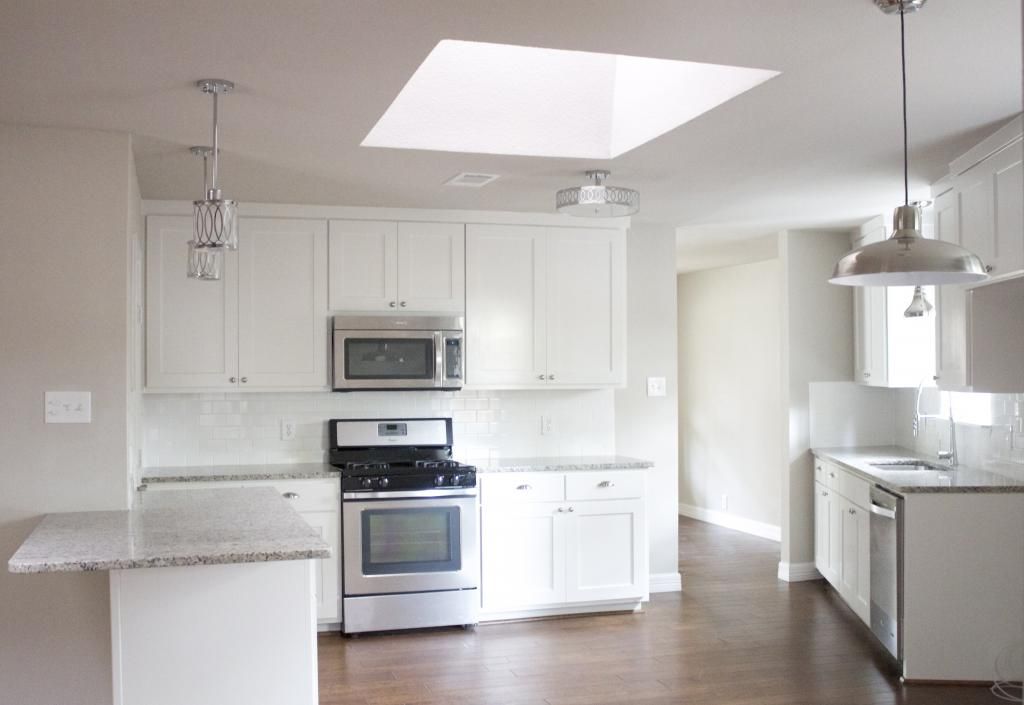
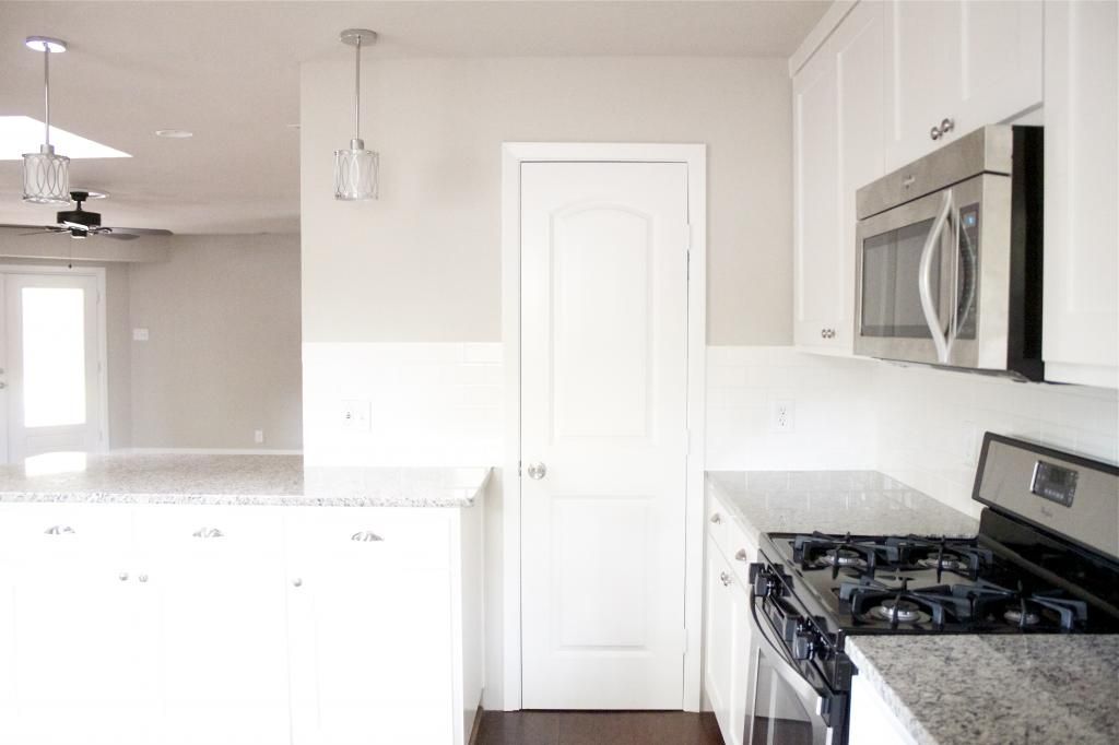
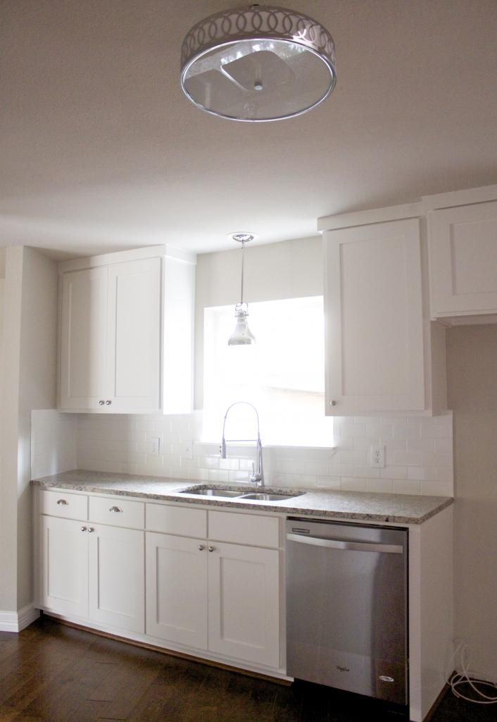
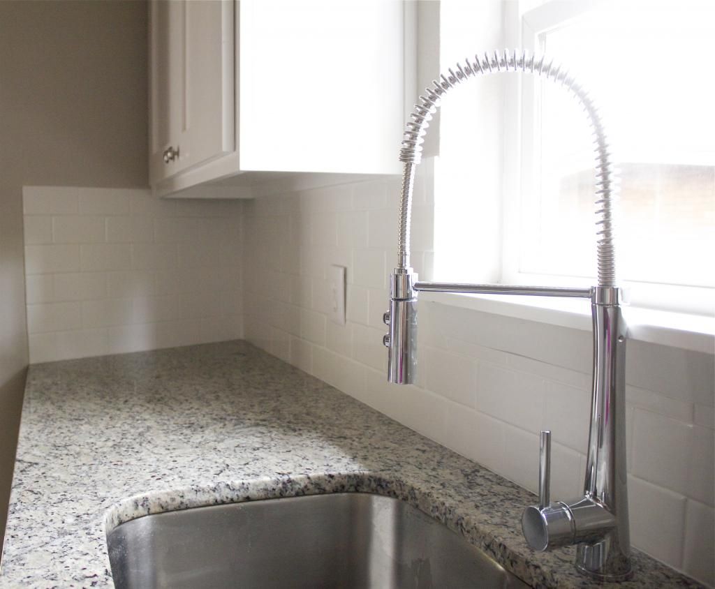
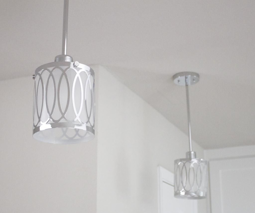
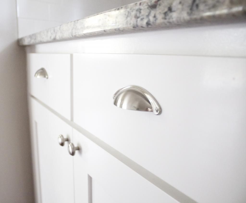
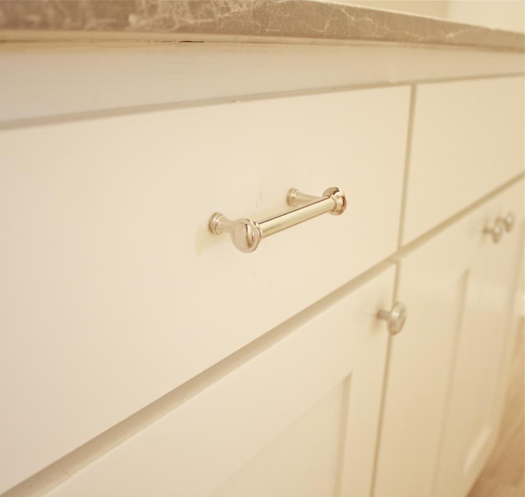
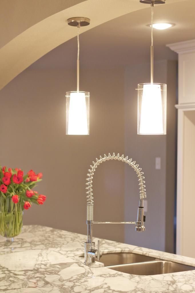
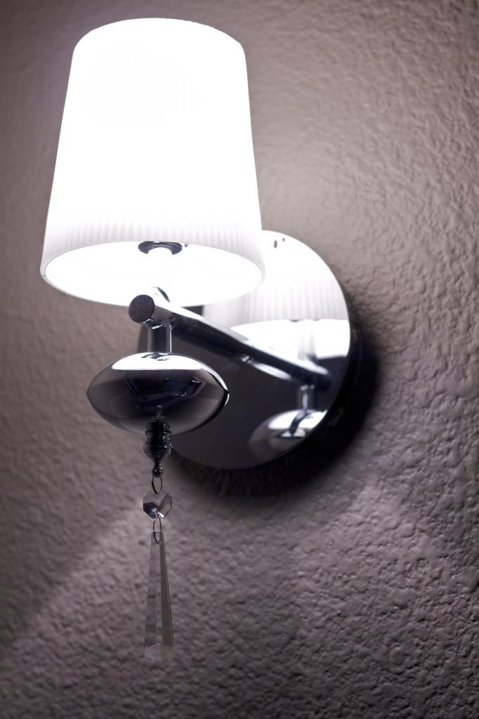
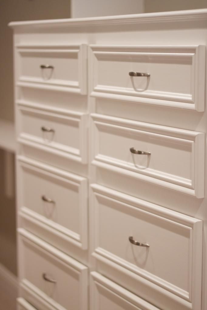
Since the ceiling line is lower in the kitchen because of the support, I kept the sight line from behind the island to the rest of the home clean and uncluttered.  I chose two clear glass pendants, even though the space could have held three.  I didn't want to junk the space up by blocking the view of the back splash and mantle, nor did I want the new owner to feel like they were staring at a pendant when they were at the kitchen sink.  I used two opposing colors of marble on the island (Statuary Carrara) and against the back splash (Astoria Grey) to offset the cabinet colors. Chrome fixtures and pulls bring it all together.


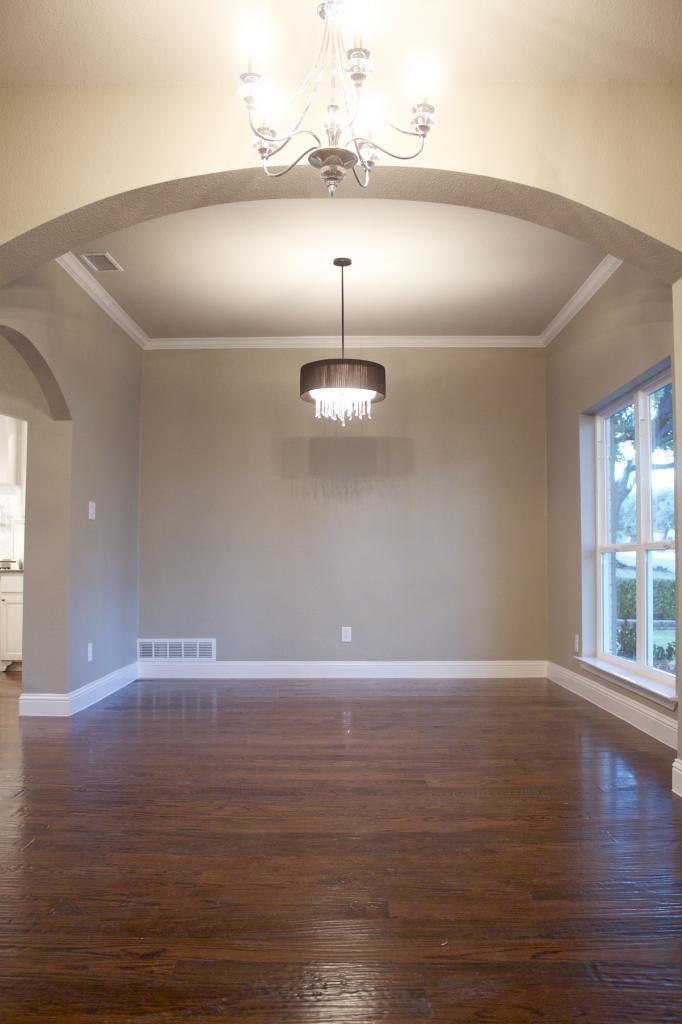
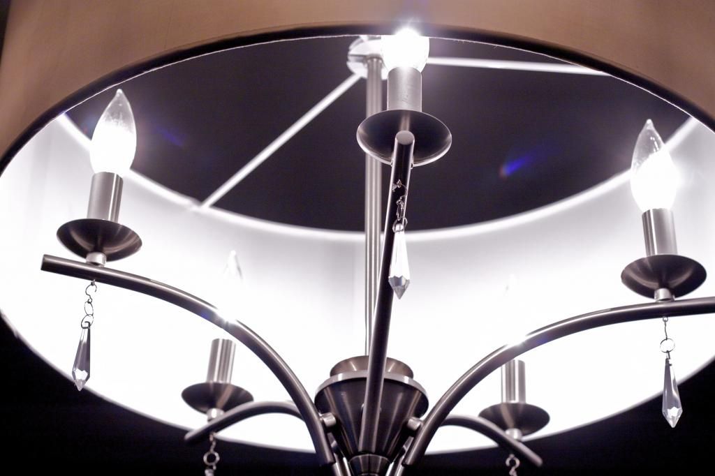
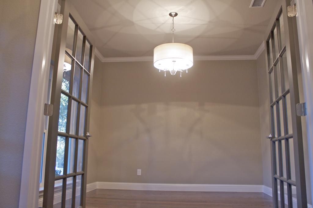
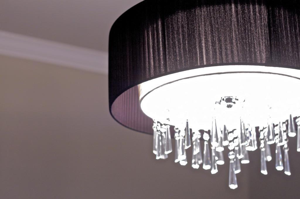
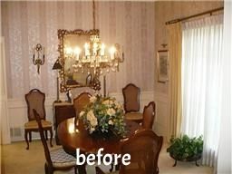
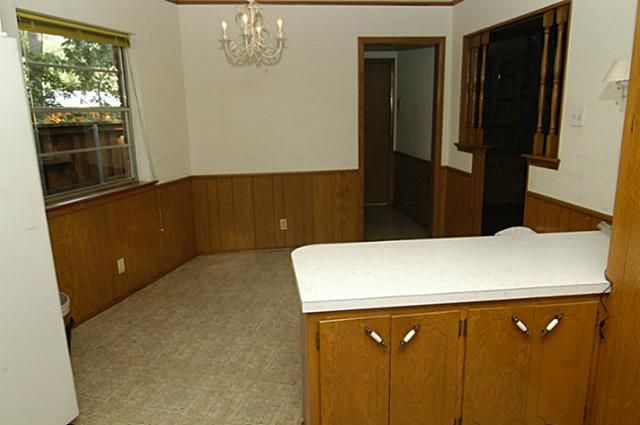
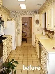
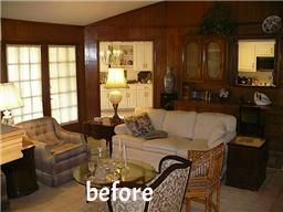
The original layout was very 1960's parlor party.  The dining room and formal living were very closed off and the Mad Men error of living is long gone.  We opened up a formal dining room and created a true office with double doors.  Glam lighting sets the stage for the prospective owner's fabulous dining table and office furniture.  I'm seeing a mirrored china cabinet with plush chairs and a black lacquer campaign desk.  But that's just me.


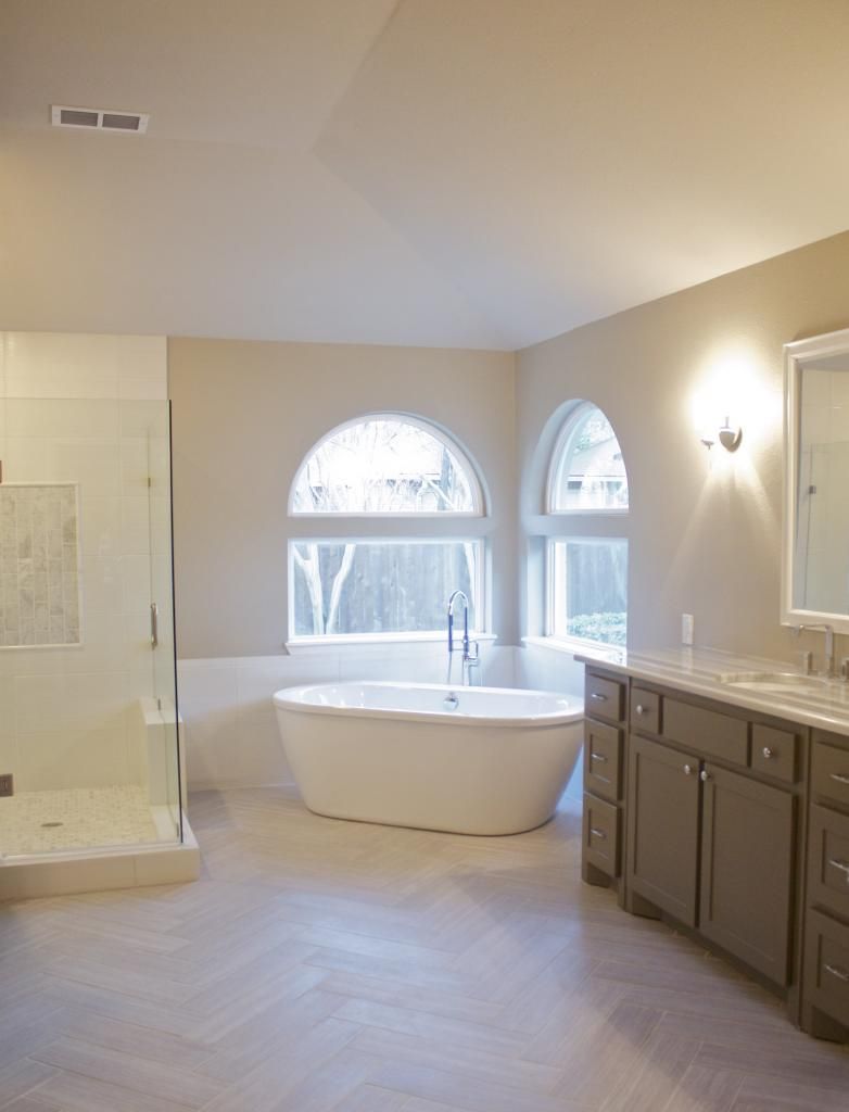
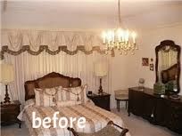
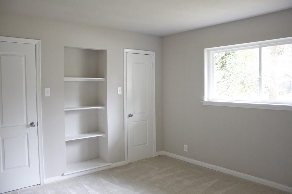
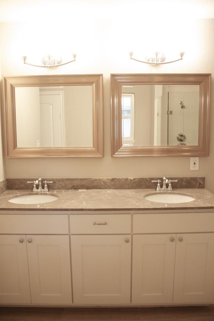
The master suite is pretty fantastic.  Nine times out of ten, we buy these fixer uppers knowing that we will need to completely reconfigure the master bedroom, bath, and closet.  Luckily, the fab old lady who lived here once upon a time was a clotheshorse and understood the need to have a big bathroom.  We still gutted the entire thing, but the sizes of the rooms and the walls stayed in place.  

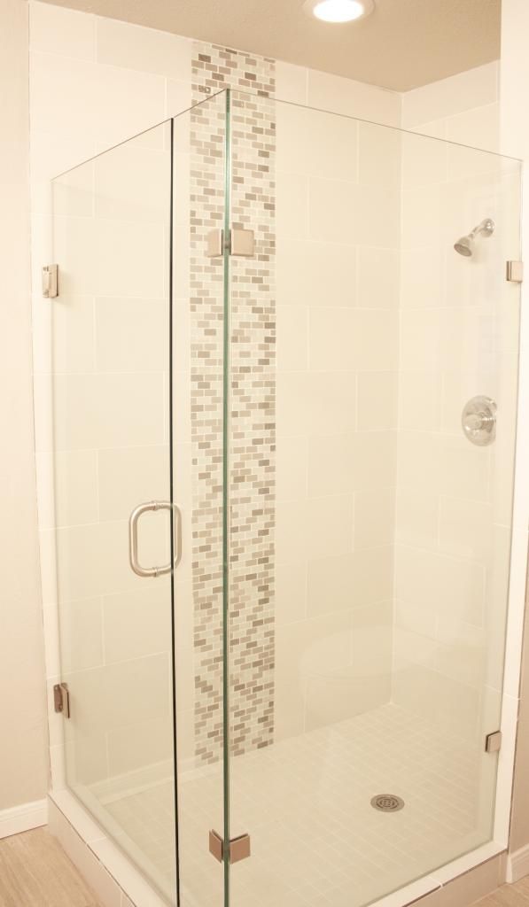
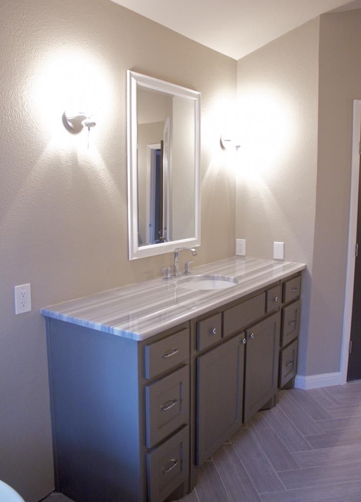
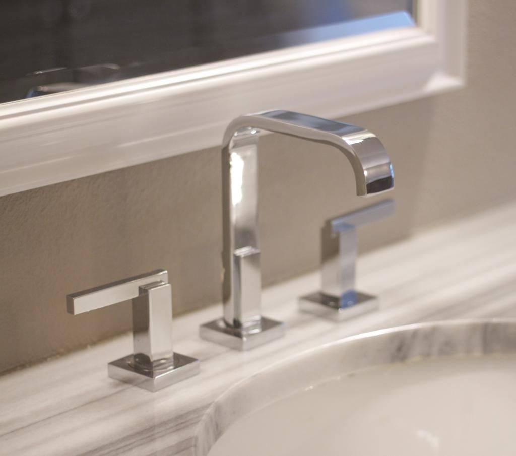
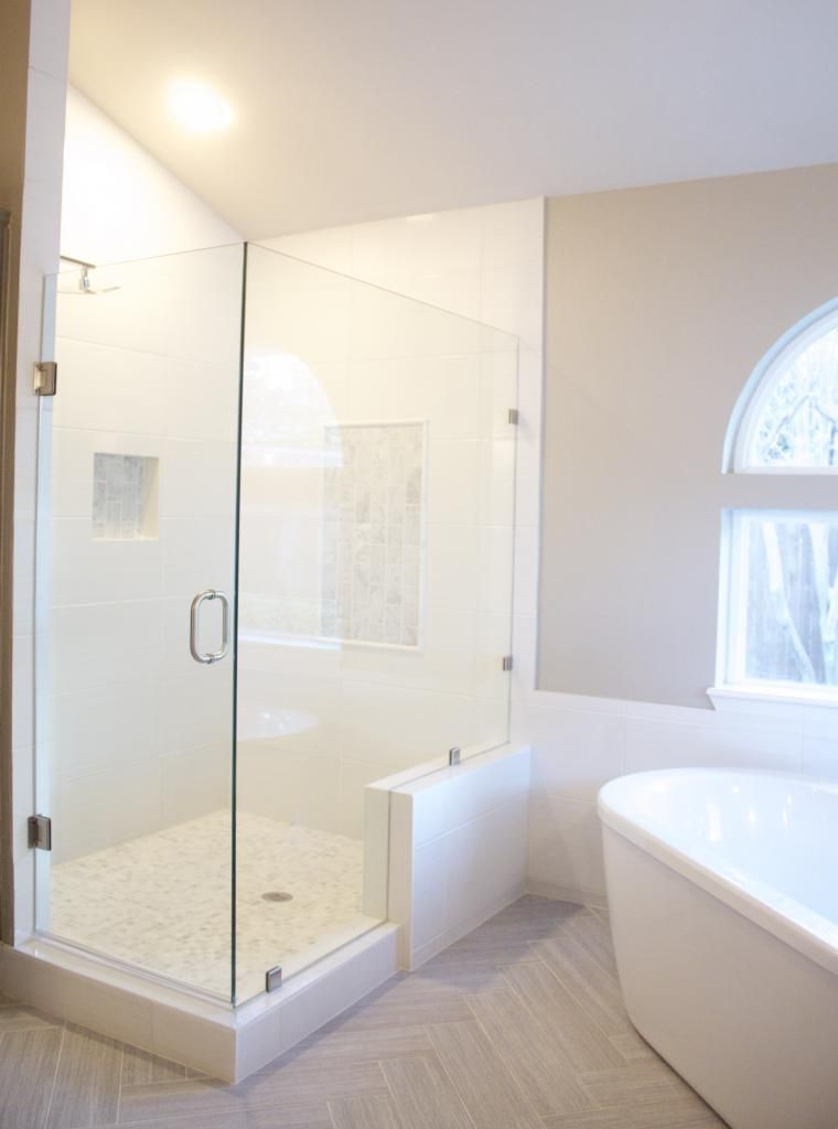
I cannot for the life of me find the before pics of the bathroom, so bear with me in my virtual walk-thru. I have been waiting for the opportunity to lay tile in a herringbone pattern and the second I saw the size of the master bath, I knew I would finally get to experiment with it.  We removed a monstrosity of a bathtub to make way for the free standing tub and filler and changed the shape of the shower which was formerly a corner unit.  I chose (again) chrome fixtures, sconces, and cabinet pulls for a little sparkle and the MaraMara Marble was a risk that I was willing to take.  I knew it was specific and a tad bit modern, but when I saw the slab, I totally fell in love with it.


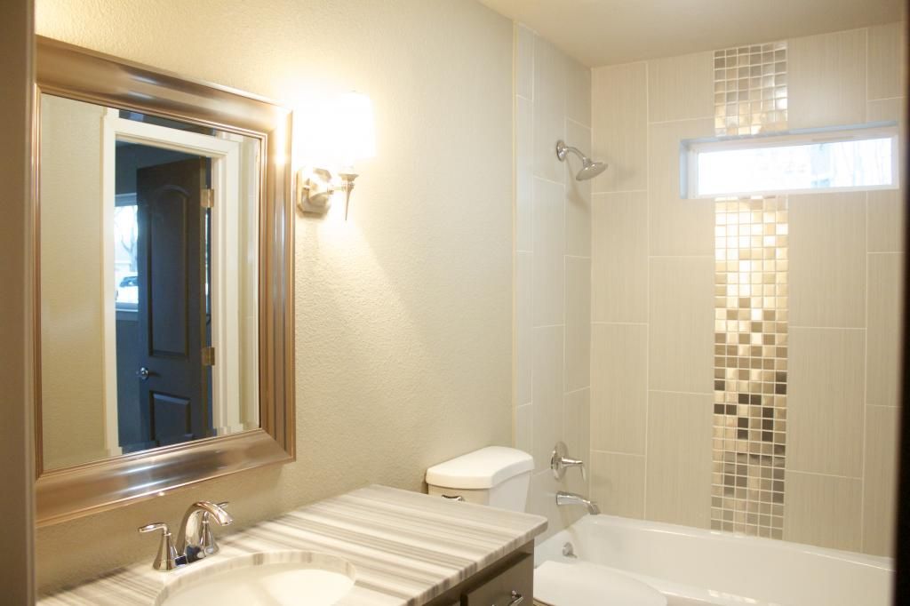
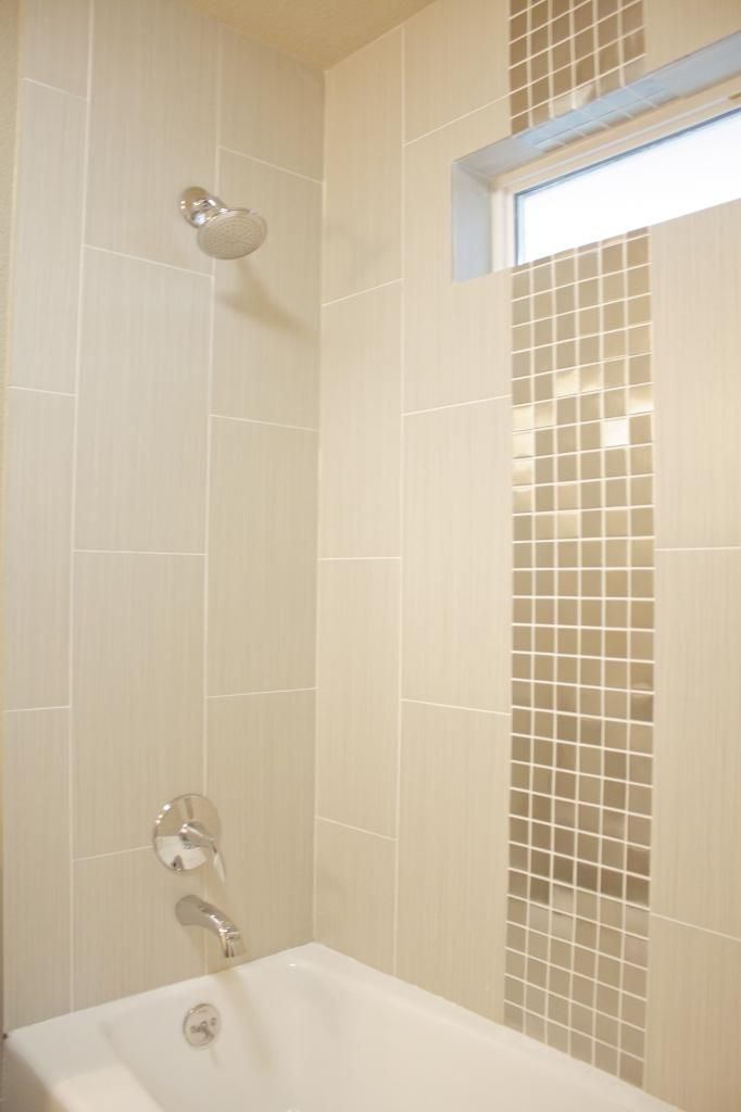
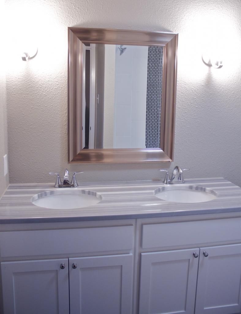
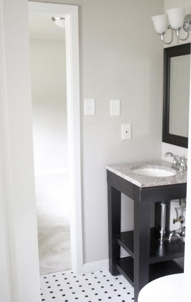
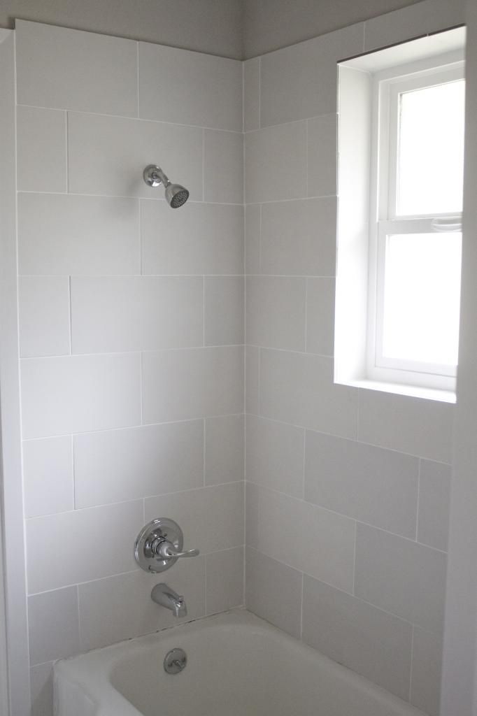
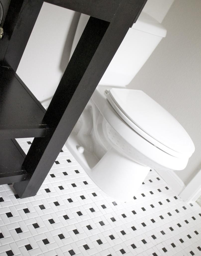
Detail in secondary bathrooms is extremely important, but there is no need to spend the same amount of money you spend in the master bathroom.  If you are looking to sell, make sure that you pay attention to little things in your additional bathrooms because most people don't and it will set you apart from the competition.  If you aren't looking to sell, you will certainly want your guests and kiddos to have a fun space as well.  I had a lot of fun designing each of these bathrooms, one for the kids since it was a Jack and Jill style bath, and the other for the split bathroom far on the opposite side of the home.  In the kids room, I used a fun smoky glass mosaic tile and very durable honed white tiles on the shower wall.  These tiles are great because they hide dirt, soap, water spots, etc.  The floors (although you can't see them) are a dark gray linear pattern with light grey grout.  For the guest bathroom, I wanted it to feel very luxe, like a hotel or a spa.  I used stainless steel mosaic alongside light grey wall tiles and light tiles on the ground, in order to offset the grey cabinetry.  


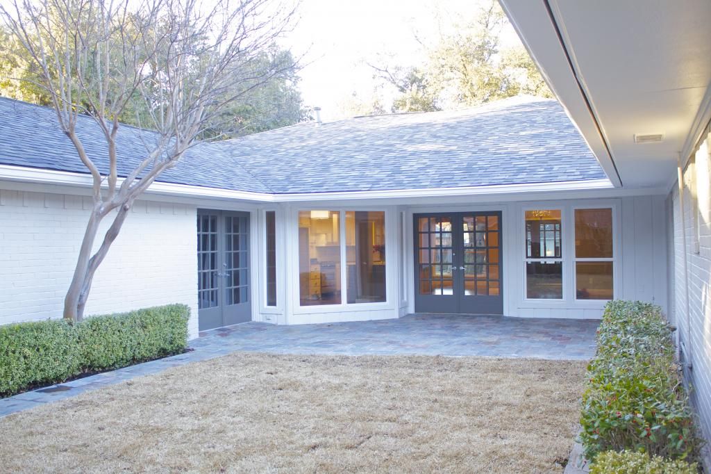
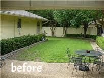
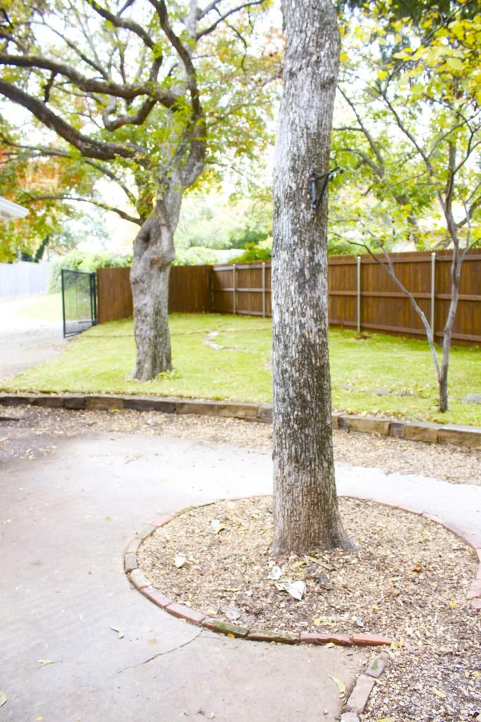
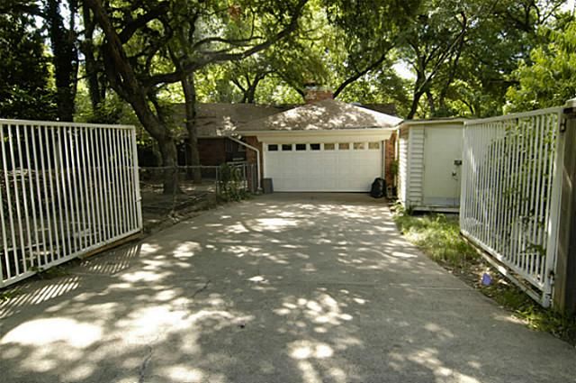
We did a lot of work on the outside of Mercedes, not because it was poorly cared for, but because it was terribly outdated.  The former patio was those aggregate pebbles that were laid in tar and feel like razorblades when you walk across them.  I had the idea to lay slate on the patio and under the walk way before I chose the paint colors and it couldn't have turned out more beautifully.  We replaced the fence and laid new sod to set it all off.  I think this is a fabulous back yard and could hold a small pool with minimal lines if the new owners wanted to put that in.  

 We love hearing feedback on what you think, maybe what you would have done differently, and of course if you love it like we do ;)  Thanks for coming along on the tour!

xoxo,
sarah


1.05.2014

Home Sweet Sunday: Our Kitchen Remodel

Since we've started our business, our weekends and most of our evenings are spent planning and picking up odds and ends for the homes we have under construction.  We are finishing up a project (which I can't wait to show you guys) and starting demo on another, so this weekend was one of those rare times when we could be at home and didn't have any other social obligations (weddings, engagement parties, baby showers).  Sometimes I forget how much I love my kitchen until I get to spend some quality time there and that's exactly what I did yesterday.  

For those of you interested in remodeling or building, the kitchen, as you know, is the most important room in the house.  Even if you eat out every single meal and use your oven for storing sweaters, spend the money on designing a great kitchen.  If you follow my Home Sweet Home board, you know I am totally obsessed with kitchen design, so when I had the opportunity to design and build my dream kitchen, I was already prepared.  My main priorities were amazing marble, a badass range, and a huge island, so those are the items that I focused on with the design. 


As you can see from the before photos, we ripped out a very long wall that closed off the living area from the kitchen.  This created a huge space for the island, which is where everyone congregates when we entertain.  We also don't have need for a dining room, so it's entrance was walled off in exchange for creating pantry space.  I didn't want double ovens, nor did I want to physically see a microwave.  Big pet peeve of mine.  We chose a 48 inch range with double ovens and a griddle that we got for a fabulous price (over 50% off) because it was missing it's feet.  We simply ordered them from the manufacturer for $100!  This was the first purchase for our new home and the whole room was planned around it.


Two budget items that I had used on other homes and knew would fit seamlessly into this home were the apron sink and cabinets pulls, both which came from Ikea.  Apron sinks can get into the thousands, but this one is huge and was only $186.  Cabinet pulls can be outrageous, especially for the larger ones and the most expensive ones in our kitchen were $6 a piece.  I do tend the splurge on backsplash tile and mosaics simply because a small area can make a huge impact.  I had the Carrara marble laid in a brick pattern for the backsplash and then a herringbone pattern over the range for something decorative and chic.


We are a bit messy in the kitchen on a day to day basis and it would have been a bad choice to put white marble throughout the kitchen.  I chose black leathered granite around the cooking areas because it holds up to grease.  The Calacatta marble is much better suited for the island where it's less likely to be stained.  I kept the cabinet design simple with shaker style door fronts but added some style with the mantle and glass fronts on either side.  You can't really see the living room TV from all points of the kitchen and we have a small tv nook so I can watch Bravo while I'm preparing dinner.  Finally, I mentioned earlier that I am not interested in seeing the microwave.  I designed a 'garage' of sorts to hide it when it's not in use.


I'm so super proud of the kitchen design and it's the one thing that people absolutely fall in love with as soon as they see it.  It's functional, stylish, and makes me happy every time I walk in the front door.  I'm so very lucky that the man trusted me to design it from head to toe exactly as I wished.  It's definitely my crown jewel!

Happy Sunday, loves!

xoxo,
sarah

11.24.2013

Bedroom on a Budget

Hi lovlies!  I hope you all had a fabulous week and are ready for the holiday ahead!  We've been fussing around here preparing for our annual trip to St. Thomas for Thanksgiving, which means LOTS of laundry.  The man went to Baton Rouge for a quick guys trip to LSU and I stayed behind to manage some last minute choices for the renovation projects.  Hopefully we can stay on schedule while we're out of town.  God willing.

So, I got the thumbs up on devoting Sundays to a house and home post, so I will be getting domestic on y'all from here on out.  I wanted to share our bedroom with you because I really tightened up the purse strings on this little makeover.  After the renovation of our home, we didn't really have much left in the budget to decorate. After pulling as much as I could from what we already had, I finished up with some wonderful items from Target, Joss and Main, and even the neighbor's garage sale!  Yep, they were moving out right as we were moving in and I snagged those Restoration Hardware lamps for $30 for the pair.  Major score!

In terms of the renovation, this master bedroom had one of those double entry bathrooms, so we walled one side up to make room for a bigger closet and to open up the space altogether.  I can show you the bathroom in the coming weeks.  New hardwoods and my trusty paint color  (SW Amazing Grey) makes the space much more comfortable and fresh. We spend sooooooo much time in here when we are home and it's definitely my favorite space in the house.


Bed: Joss and Main
Pillows: West Elm (old), Target (old), Ikea Sanela
Art: World Market (in store)
Rug: Sam's Club
Drapes: Ikea Merete


xoxo,
sarah


11.17.2013

Home Sweet Sunday

I've told you before that both my fiancĂ©' and I are mortgage bankers during the week, but on the weekend we enjoy renovating and remodeling homes.  Back in May, I posted this remodel and you guys went absolutely bonkers and have been begging for more ever since.  I'm thinking about reserving Sunday posts for stuff that has to do with home.  I have a ton of content (I haven't even shown you guys the house we live in!) and we have more projects in the works.  What do you think?  I'd love to hear your feedback in order to keep the integrity of the blog.  This is a huge and very enjoyable part of our life that we don't really get to share.

So, about the house: we bought this little junker a couple months ago that had been horribly neglected for several years.  Of course it smelled absolutely putrid, and someone had even left an old dog out back in the jungle of a yard, poor thing!  We always say "The uglier the better!" and we took this home to heart.  The neighborhood is very desirable and is a great place to buy for couples, small families, and even empty nesters who want the suburban feel without being too far from the city.  This particular home sits on a green belt and had a layout very similar to White Cliff, so it was a relatively easy project from a design perspective.  The challenge was the sheer amount of work.  The sweet couple who bought the home really is getting a brand new home, inside and out (minus the brick). We got a little squeamish on the budget and really bargain hunted for everything we could, without sacrificing quality.  We found some AWESOME buys and they ended up looking so great.  I was so excited for this house to be finished because it really is a great home for a couple starting a family.  Our buyers are 7 months pregnant with their first little one and it just seemed like it was meant to be.

I'm gonna take you on a little tour, friends.  Without further adieu, here is 11811 Cheswick!

We had a lot to clean up on the outside, as you can see from the before photo below.  The ivy had grown all the way up into the trees and completely taken over the front yard.  We had it cut down (it will eventually die and fall off the trees) and we pulled up all the ground cover and laid sod.  The junk trees in front were removed so you can see the house, and we left the nandinas to fill out after someone did a hack job on them before we purchased the property.  We replaced all the original metal windows with bright white vinyl ones and painted the brick a gorgeous grey.  We salvaged the original shutters and front door and painted them black for a little contrast.

This is where the biggest difference was made, in my opinion.  Not only did the kitchen have carpet,  (yes, you heard that right), but it was completely cut off from the huge family room and felt completely disjointed.  We opened that wall and replaced the dated cabinetry with a new shaker style.  New stainless steel Whirlpool appliances, Santa Cecilia Light granite, and shiny light fixtures finish out the kitchen perfectly. All the drywall was retextured and repainted so the home feels brand new inside.


In the original layout, there was no pantry, only a very small double oven and some cabinets.  Luckily, there was a random, but huge closet on the other side of the wall in the entry way, so we took half of it and designed a walk in pantry.  The other side is a cute little half bath.


I love making the most out of 'accessories' in a home, especially in the kitchen.  At this price point, little luxuries made a huge impact and shiny chrome does the trick.  I love using chrome fixtures whether the price point is $100,000 or $1,000,000.  And it's always the least expensive finish when fixtures have multiple options.


The house has a funky little angle to one side of it, so we decided to incorporate a peninsula rather than an island.  I would have had to place the island at an angle an well and it just felt a little uneven.  I'm big on symmetry, especially in the kitchen, and the peninsula provides plenty of bar stool space and room to gather.


Can you imagine not being able to see this gorgeous fireplace and get the natural light from the new french doors?  The old design blocked it all and the old peninsula made you feel trapped in the kitchen. What a difference it makes to simply turn it ninety degrees.


Typical with homes built in the 60's and 70's, there were big built in hutches on either side of the fireplace, that we simply popped out.  There were also decorative (if you can even call them that) circles on the ceiling throughout the home that just had to go.  We slapped some paint on the fireplace, replaced all the wall paneling with fresh drywall, and laid new hardwoods.
I messed up and didn't take before photos of the rest of the house, but you can imagine how dated and stale it was.  There are two bedrooms that are connected by a Jack and Jill bath.  The bedrooms got received new carpet and shelving (how cute will this be as a nursery?!!?).  I chose the pinwheel tile for the bathroom floor because it's playful and cute and I had the guys cut down some white and grey tiles to 12 x 24 for a more modern feel.  Simple ideas like changing the shape of your tile can make a world of difference.  This tile was .49 a square foot on special at a surplus store.  It has a rougher texture so soap won't show as easily as with a polished tile.  


Now, for crowned jewel #2: the master bath. This room was a hot, disjointed mess.  First off, it had a hallway entry, which took away the ensuite convenience.  We walled that up and completely redesigned the bathroom.  It had a tiny shower that felt like stepping into a cave and had another wall that made it tiny.  We basically started the whole space over from scratch and added two closets, a large walk in shower, and double vanity.  It's hard to see in the photos, but I have been dying to use ceramic planks in a wood pattern and I finally got the opportunity.  They are a gray white washed wood grain and are just stunning with the marble.  Speaking of the marble, this was a remnant that my contractor picked up at the stone yard.  To.die.for.  


In the back, we replaced a chain link fence with a gorgeous, stained one and replaced all the dirt with fresh sod. Once we cleared away all the junk, we discovered that the yard was tired for drainage by these pretty stones, so we kept that detail and I love the way it looks.  This house also had a white gate in back that, when we purchased the home, we didn't realize was electric.  It wasn't in working condition, but after a quick visit from the electrician, it works like a charm and is a rare amenity for the neighborhood.  We had it painted black to go with the color scheme.


This was a really fun little remodel and I was really proud of the way it turned out.  I think it will be a great home for the couple that bought it and I hope they have a million happy memories here!

xoxo,
sarah